2018 Website Goals: Responsive Design & Why You Need It
Consumers use any number of different devices to surf the web, including laptops, desktop computers, tablets, and smartphones. In order to provide a seamless experience to potential customers no matter what device they are using, your business website needs to be built with responsive web design in mind.
What is responsive web design? And why is it such an important part of your overall digital marketing strategy? Here’s everything that you need to know.
An Introduction to Responsive Web Design
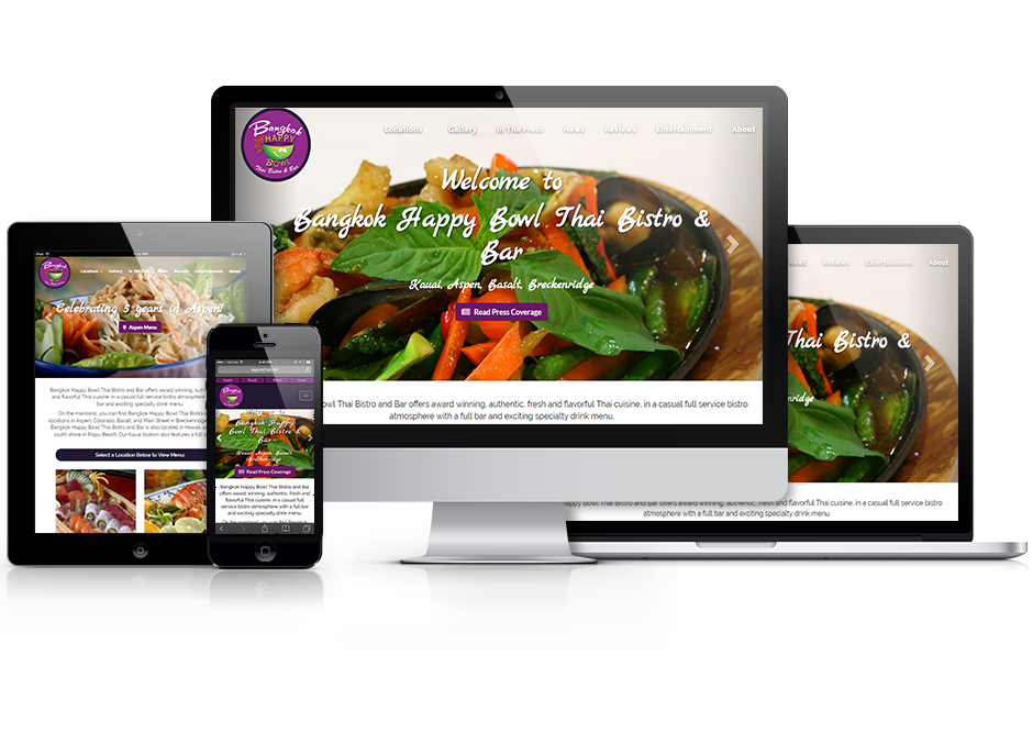
A website that utilizes responsive web design will automatically resize depending on the type of device being used to access the site.
Because responsive websites intuitively respond to the type of device being used and adjust the layout of a website accordingly, information is more easily accessible and the the user experience is much more enjoyable. No more scroll bars, no more pinching and squeezing to be able to read content and no more separate mobile sites. Think beautiful, clean websites that are easy to read and navigate on any device.
The Importance of Responsive Web Design
Thinking of updating or building a new website for your business? Here are some of the many reasons you should consider going with a web designer that knows how to create responsive website design:
Consumers Steer Clear From Websites That Aren’t Mobile Friendly
57% of mobile users say they won’t recommend a business that has a poor user experience on their smartphones.
Today, mobile users account for nearly half the internet traffic. Consumers will leave your website if it is difficult to navigate, to find information or if it takes too long to load on their smartphone or tablet.
If a user finds your site too hard to navigate or read, they will leave without engaging--and you will have lost a potential lead.
Be Accessible, No Matter the Device Being Used
We live in an age where consumers are updating and upgrading their smartphones or tablets constantly.
Responsive websites will automatically adjust when accessed by new devices that hit the market. This means you won’t need to update the code or the design every time a new smartphone or tablet is introduced.
You’ve Got a Limited Amount of Time to Catch a Consumer's Attention
In today’s fast-paced environment, websites that don’t load within 9 seconds are considered to have a poor loading time by industry standards, across the board.
Using a responsive web design can improve the load time on your website--an important feature given the tendency by consumers to lose patience easily.
Your Search Ranking Will Go Up with Improved SEO
Your visitors won’t be the only ones impressed with your website—Google will be, too. Google knows that a responsive design creates a better user experience, so they will reward you by placing your page higher than other sites that don’t have this type of design, particularly for searches being conducted on mobile devices.
Surprisingly, It Costs Less to Create & Maintain, So You Can Focus on What Matters
If you don’t know much about web design, it may seem as if this type of website would be harder to build since it needs to be designed with all types of devices in mind. But fortunately, that’s not the case.
A responsive web design only requires one set of code, whereas a non-responsive web design will require a set of code for every different device, orientation, and screen resolution. And while all websites will require maintenance once they have been launched a non-responsive design is much more high maintenance than a responsive design. This is due to double the amount of work being placed on separate version of a website (mobile and desktop).
One Analytics Report as Opposed to Many
Trying to make sense of analytics can be difficult when you have two separate websites. Fortunately, businesses with responsive websites don’t have to worry about this since the data is combined in one report.
The Denver Website Designs Difference
We’ve made it our business to provide seamless responsive web design for our clients, no matter their industry. From e-commerce to brick-and-mortar businesses: Denver Website Designs has created hundreds of responsive web designs that have improved our clients online presence.
We Save You Time
Because we’ve streamlined the process, Denver Website Designs can have a website created for you within six to seven weeks from you signing a contract.
We Save You Money
We’ve got creating a responsive website down to a science and have an effective system for creating a unique online presence for clients. Because of our effectiveness we’ve been able to pass on the savings to clients!
We Provide More than Just a Website
Part of what makes our model so much more appealing is the inclusion of other marketing functions built into the back end of every DWD website. Clients have access to Email Marketing, a CRM System (Customer Relationship Management), Reputation Management and a Blogging tool to name a just few features. Our software, along with our local in-house team, makes Denver Website Designs a no-brainer for those looking to improve their web presence and digital marketing reach.
For more tips on how to improve your digital marketing strategy, get in touch with the experts. At Denver Website Designs, our team has helped companies of all sizes grow their business by improving their websites. Learn more about our process and how we can help your business grow with a comprehensive digital marketing plan!
Go Back What is responsive web design? And why is it such an important part of your overall digital marketing strategy? Here’s everything that you need to know.
An Introduction to Responsive Web Design
A website that utilizes responsive web design will automatically resize depending on the type of device being used to access the site.
Because responsive websites intuitively respond to the type of device being used and adjust the layout of a website accordingly, information is more easily accessible and the the user experience is much more enjoyable. No more scroll bars, no more pinching and squeezing to be able to read content and no more separate mobile sites. Think beautiful, clean websites that are easy to read and navigate on any device.
The Importance of Responsive Web Design
Thinking of updating or building a new website for your business? Here are some of the many reasons you should consider going with a web designer that knows how to create responsive website design:
Consumers Steer Clear From Websites That Aren’t Mobile Friendly
57% of mobile users say they won’t recommend a business that has a poor user experience on their smartphones.
Today, mobile users account for nearly half the internet traffic. Consumers will leave your website if it is difficult to navigate, to find information or if it takes too long to load on their smartphone or tablet.
If a user finds your site too hard to navigate or read, they will leave without engaging--and you will have lost a potential lead.
Be Accessible, No Matter the Device Being Used
We live in an age where consumers are updating and upgrading their smartphones or tablets constantly.
Responsive websites will automatically adjust when accessed by new devices that hit the market. This means you won’t need to update the code or the design every time a new smartphone or tablet is introduced.
You’ve Got a Limited Amount of Time to Catch a Consumer's Attention
In today’s fast-paced environment, websites that don’t load within 9 seconds are considered to have a poor loading time by industry standards, across the board.
Using a responsive web design can improve the load time on your website--an important feature given the tendency by consumers to lose patience easily.
Your Search Ranking Will Go Up with Improved SEO
Your visitors won’t be the only ones impressed with your website—Google will be, too. Google knows that a responsive design creates a better user experience, so they will reward you by placing your page higher than other sites that don’t have this type of design, particularly for searches being conducted on mobile devices.
Surprisingly, It Costs Less to Create & Maintain, So You Can Focus on What Matters
If you don’t know much about web design, it may seem as if this type of website would be harder to build since it needs to be designed with all types of devices in mind. But fortunately, that’s not the case.
A responsive web design only requires one set of code, whereas a non-responsive web design will require a set of code for every different device, orientation, and screen resolution. And while all websites will require maintenance once they have been launched a non-responsive design is much more high maintenance than a responsive design. This is due to double the amount of work being placed on separate version of a website (mobile and desktop).
One Analytics Report as Opposed to Many
Trying to make sense of analytics can be difficult when you have two separate websites. Fortunately, businesses with responsive websites don’t have to worry about this since the data is combined in one report.
The Denver Website Designs Difference
We’ve made it our business to provide seamless responsive web design for our clients, no matter their industry. From e-commerce to brick-and-mortar businesses: Denver Website Designs has created hundreds of responsive web designs that have improved our clients online presence.
We Save You Time
Because we’ve streamlined the process, Denver Website Designs can have a website created for you within six to seven weeks from you signing a contract.
We Save You Money
We’ve got creating a responsive website down to a science and have an effective system for creating a unique online presence for clients. Because of our effectiveness we’ve been able to pass on the savings to clients!
We Provide More than Just a Website
Part of what makes our model so much more appealing is the inclusion of other marketing functions built into the back end of every DWD website. Clients have access to Email Marketing, a CRM System (Customer Relationship Management), Reputation Management and a Blogging tool to name a just few features. Our software, along with our local in-house team, makes Denver Website Designs a no-brainer for those looking to improve their web presence and digital marketing reach.
For more tips on how to improve your digital marketing strategy, get in touch with the experts. At Denver Website Designs, our team has helped companies of all sizes grow their business by improving their websites. Learn more about our process and how we can help your business grow with a comprehensive digital marketing plan!